
Global Navigation & footer
September 2019 — September 2020
Company: HubSpot
Project: Global Navigation & Footer Redesign
Team: Web Strategy
Role: Lead UX Designer
Key Responsibilities:
Project Management
User Research
Information Architecture
Content Strategy
User Experience & Visual Design
THE PROBLEM
Over the years, HubSpot’s website strategy has continuously evolved. We’re focused not just on click-through rates (CTR) and conversion rates (CVR), but also on improving usability, SEO, page performance, and accessibility. Our navigation and footer served as useful testing grounds for these new improvements, and over time, the design came to reflect that approach with inconsistent menu layouts and interactions, confusing information architecture, random links, etc. The navigation elements were working for us, but were they working for our users?
We considered: How might we simplify the global nav and footer to help users get to important information faster? How might we update our navigation to better reflect and scale with our growing product and service offerings? How might we align search equity to high-priority product pages, free tools that drive more leads, and directories that support platform positioning?
We’re gonna need a simpler nav

Before and after redesign of the website header navigation component

Before and after redesign of the website footer component
Setting a baseline
To understand where to start, we collected benchmark data to learn what we were already doing well and where friction existed. First, our team reviewed and analyzed initial click-tracking and conversion-mapping data, then conducted stakeholder interviews to understand the history of the nav design, like which links were non-negotiable (i.e. Privacy Policy in the footer) and why certain terminology was used (i.e. Software vs. Products). This analysis revealed some key findings, including:
Low CTRs suggested the About menu wasn't providing much value to visitors; the variety of links in the menu increased cognitive load.
Low CTRs suggested the Partners menu might be confusing to non-partners, creating an opportunity to surface those links and drive more traffic to those pages.
Majority of the Resources menu engagement occurred within the How-To submenu, suggesting a strong appetite for educational resources.
Next, I approached the discovery phase as a mentorship opportunity for our UX intern, as I partnered with him to conduct competitive research and set up an unmoderated Tree Test. The Tree Test revealed users experienced the least friction with locating information on our products, pricing, and free educational resources; they experienced the most friction with understanding the partner menu, locating common links directly, and hover interactions.
These findings provided a starting point for reimagining the information architecture of the nav and footer. Our recommendations focused on where we could make the most impact:
Partner Menu: Improve comprehension and discoverability of menu items
Resources Menu: Reduce cognitive load to improve discoverability of menu items
Hover Interactions: Solve for the the diagonal problem (pictured below), where a user opens a menu and moves toward a link, but their cursor opens a different menu as the cursor travels
Example of the diagonal problem
Question: Where would you go to connect with a HubSpot expert?
“I saw that one. Where is it? Resources, For Customers, Professional Services... I’m pretty sure that’s it but let me look at everything else. Partners... oh! Hire an agency — there. Oh that’s not it, I was wrong.”
“I’m assuming it would be under Resources, maybe under User Groups or Professional Services. The only place I would expect it to be would be About or Resources but it seems like Resources would be the better spot.”
Question: Where would you go to apply for a job?
“Typically when I go to apply for a job online, the first thing I do is scroll to the very bottom [of the page].”
Revitalizing the Information Architecture
My team and I began to ideate on the information architecture, incorporating feedback from stakeholders along the way. We realized we still had questions for users on how they would group and label our links themselves, so I set up a card sort with 20 participants (a mix of prospects and current customers). I was particularly curious about how users would categorize partner, marketplace, and resource links.
The results validated submenu headings that could improve wayfinding, as well as which links were important enough to position on their own. As shown in the dendrogram chart below, the majority of users grouped all contact links together. We considered whether to keep these links grouped, but ultimately decided each was aimed at a different persona and that placing them in the same menu could lead to increased choice-paralysis.

Header Nav — Solving for Flexibility
When designing the header component, my goals included:
Global-First: Flexible sizing and spacing to account for regional variations, ensuring a consistent nav experience across all regional websites to build global brand awareness
Consistency: Fully responsive and consistent nav design across all devices, browsers, and supported regions
Wayfinding: Improve wayfinding cues and introduce breadcrumb nav to product pages, which would also improve SEO
Flexibility: Decrease the component height to allow more space for above-the-fold content and secondary nav elements like breadcrumbs
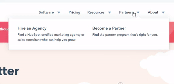
The new header nav has been simplified to three top-level menu items -- Software, Pricing, Resources -- leaving space to experiment with new menu items and reducing overall cognitive load. The partner program links have been absorbed into the Resources menu to help non-partners locate them more quickly. And for partners, we made the new location easy to find with a dedicated submenu. We also continued iterating on link names, striving for clarity in our final solution. Here's a look at the desktop Resource menu before and after:

And here's a look at the redesigned top-level mobile menus:

We grouped customer links together, creating a one-stop shop that capitalizes on existing mental models. On desktop, the About menu shifted to the utility nav so it no longer competes with high-value menu items. We collaborated on two potential solutions for the Software menu and decided to run an A/B test with both concepts to determine which best served our business and users.
Last, I updated the sticky nav behavior. The previous utility nav included only two actions: the “Get started free” CTA and Sales phone number. Now that I’ve moved the CTA into the header nav, website visitors always have easy access to the CTA and the top-level links that allow them to browse the site.

Designing a Scalable footer
When designing the footer, I prioritized clarity and scalability. My goals included:
Reducing the overall height of the footer to decrease scroll across the entire website (after observing a high correlation between higher CVRs and shorter pages)
Capitalizing on existing mental maps by including company and customer links under clear headings
Meeting SEO and acquisition business objectives to highlight high-value feature pages and lead-generating free tools
Fully responsive and consistent layout across devices, browsers, and supported regions
Footers can easily become a link dumping ground. They can be tough to navigate on desktop and nearly impossible to use on mobile devices. But I had to believe robust responsive footers didn’t have to suck, and I was on a mission to prove it. The new footer is organized into five submenus:
Popular Features: I collaborated with SEO to brainstorm link names that would rank well and still meet character limits.
Free Tools: HubSpot’s lead-gen tools are amazing -- they’re delightful, user-friendly free resources. The redesigned footer surfaces these links, driving more traffic and lead capture.
Company: Research confirmed that company links are expected in the footer.
Customers: Ensuring customers can always easily locate resources like support and local user groups.
Partners: To mitigate the risk of losing a top-level Partner menu item, we created a menu just for partners in the footer.

Before and after looks at the redesigned mobile footer component
The results
Where are the clicks going in the nav, before and after the redesign?
The redesigned navigation components launched in September 2020 and are performing quite well. Most of our design decisions were validated by the data, since we're seeing additional clicks to the majority of links that were repositioned/redesigned.
How did clicks to specific links and sections change after the redesign?
Log in: We observed a 6% increase in unique clicks, indicating an improvement in discoverability.
Partners: When you add clicks from the Partners link under Resources and the Partners links in the footer, there is a 157% increase in unique clicks.
About: This changed from a top level menu item to a dropdown in the utility nav. Additionally, some items were removed from the dropdown and placed into the footer. The About button itself and all items in its submenu saw increases in unique clicks, ranging from a 9% increase to a 514% increase.
CRM: There was a 28% decrease in unique clicks. We believe that the link to the Get Started page (GSP) above it — a new addition to the Software menu — may be siphoning away some of those clicks.
GSP: This changed from a Get HubSpot free primary CTA button in the header to a Get HubSpot free primary CTA button in the main nav plus a link under Software. There was a 64% increase in traffic to the GSP from the nav.
What’s next?
While some of the decrease in CVR can be attributed to the increase in traffic, we believe there is disconnect in user expectation for the "Overview of all products" link in the Software menu that takes users to a lead-gen landing page rather than an informational product page. This data supports our decision to build a true product overview page as a next step. We will also conduct an A/B test of the software menu design concepts and, based on the results, implement the winning concept.