
HubSpot Pricing
October 2018 - April 2019
Company: HubSpot
Project: Pricing Experience Redesign
Teams: Web Strategy & Growth Monetization
Role: Lead UX Designer, Web Strategy
Key Responsibilities:
User Experience & Visual Design of:
Freemium CRM Experience
Product Hub Experience
Product Comparison Table
Responsive Experience
Background
Over the past few years, Web Strategy and Growth Monetization have focused on helping people adopt and buy HubSpot products. Historically, we’ve had a heavy focus on creating demand (QLs) through marketing efforts and a freemium product experience. However, we believe that the best way to scale revenue and reduce cost of acquisition is to allow customers to adopt and buy products in a way that’s best for them, whether through a sales conversation or through a touchless buying experience.
In order to scale more revenue touchlessly, we need the pricing page to do a better job at helping customers understand the value, benefits, and differences of our plans — something that Sales Reps are better at doing today.
By aligning our teams on experience goals and business outcomes, we believe we can create a better experience for potential customers both in-app and on HubSpot.com that drives more revenue for our business.

Defining The Problem
Getting Started
The pricing page redesign began with the customer. We split the project into seven stages with four multi-method checkpoints, including three qualitative and one quantitative. Research and design worked in tandem to capture insights, brainstorm concepts, iterate, and test. We recruited a mixture of free users, paying customers, and people who had never used HubSpot before to account for new visitors to the website pricing pages. The biggest themes that emerged included comprehension, orientation, and configuration.
Comprehension

Initial research revealed a gap in the way HubSpot communicated value and the way our users perceived value. While many participants understood they’d get “more checkmarks” by upgrading their plan, they struggled to communicate how their business would benefit from doing so. The pricing page did a good job of communicating our quantity of features, but we weren’t adequately communicating the value-add of our product tiers.
Lead Product Designer Mariah Muscato created a “Value & Benefit Worksheet” that allowed HubSpot experts from product, marketing, and sales to collaborate on the values of our tools and features. This exercise revealed a distinction between hero features and supporting features, and aligned the content strategy around meeting customer goals. We applied the refreshed positioning into new design concepts (pictured below) and took them into testing. We knew from our initial research that customers were driven to the pricing page out of interest in a few specific features. But in concept testing, when we grouped lists of features by common business objectives, the user’s evaluation set expanded from a couple features to all the features under the objective. Not only that, but we found users could more easily articulate the value of each product tier when they understood what our features could help them accomplish.

Concept 1: The Constellation by Mariah Muscato
Goal: Help me easily compare plans

Concept 2: The Quiz by Kiona Lynn (me)
Goal: Help me understand where to start my evaluation
Concept 3: The Matrix by Hristo Kanchev
Goal: Help me understand everything HubSpot has to offer
Orientation
Our initial round of research found users struggling to orient themselves in our vast product ecosystem, due in part to:
An abundance of information and features
Visual uniformity of products and plans
“Endless clicking” needed to compare plans
Additionally, we knew the former design couldn’t support the launch of new products, plans, and features due to layout constraints. To solve these problems, we explored a variety of new layouts focused on separate user goals. My goal was to help users understand where to start in their evaluation process. I created an introductory product overview page (see Concept 2) with a diagnostic quiz that provided a tailored product recommendation to users. Many users missed the CTA to launch the quiz in their haste to find price points and feature listings. However, when directed to the quiz, users found the recommendation to be a helpful starting point, explaining that they considered HubSpot a subject matter expert and could therefore trust our recommendation.
We also tested a concept by Mariah that helped users conduct side-by-side pricing plan comparisons, and a concept by UX Designer Hristo that included the complete suite of HubSpot offerings all on one page. There were winning elements in each concept, so we merged those elements into one final design direction that was again iterated upon and validated with customers.
Configuration
Mariah took the lead on configuration, including designing a new multi-product calculator heavily influenced but our sales team stakeholders and quantitative data gathered around the multi-product touchless buying experience. Previously, there was no way to see the total cost of buying multiple products on the pricing page. Now, there is.

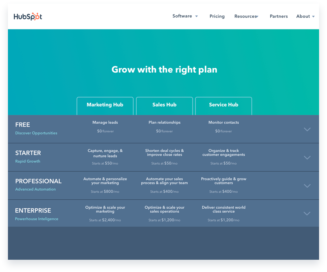
Full product & feature comparison table

Product icon exploration by designer Amanda Chong
The Final Solution
Solving for the customer
Comprehension: The new content strategy aligns the pricing page with our customers’ value perception and evaluation process.
Orientation: The new layout encourages deeper exploration of HubSpot’s paid tools and further differentiation of HubSpot’s core product offerings.
Configuration: A new experience for multi-product purchase and configuration.
Solving for the business
Unified code: Unified pricing page app with code that’s shared across product and marketing, allowing us to reduce technical overhead and provide a truly consistent customer experience… forever.
Faster translations: A new translation process that reduces translation time, enabling us to ship changes more quickly.
System of record: A centralized system of record for feature names, feature descriptions, product positioning, etc.
Solving for the future
Unified analytics: Unified analytics tracking across visitors, users, and customers that will allow us to better understand behaviors and needs across various segments.
Experimentation platform: The experimentation infrastructure that enables A/B testing, multi-armed bandit testing, and engineering-less copy experiments at scale.
Future investments: A vision for how the pricing page will enable more informed pricing and packaging decisions along with some experiments we’ve already queued up.
Thanks for Mariah for documenting this process. We collaborated on the final write-up and I highlighted the Web Strategy components here.
Thanks to Amanda for collaborating with us on a design system for our product suite.