When the Web Strategy team kicked off a redesign of HubSpot’s Diversity & Inclusion page, we set an intention to create a fully accessible and inclusive experience. We could rally around a mission statement all we wanted, but we knew if we were going to talk the talk, we also had to walk the walk. I was the lead designer on this project, and I'd like to walk you through our process and learnings.
Copy
Corey, the lead copywriter, began with the story we wanted to tell. HubSpot’s written tone is warm, friendly, and engaging. The challenge was to convey those feelings while also writing copy that was accessible to non-native English speakers and visitors with varying levels of education. So Corey distilled our messaging down to simple yet powerful HubSpot truths: You are welcome. Come as you are. We grow better together.
During the initial brainstorm, as we collaborated on our mission statement, we discussed an animation concept: what if the initial headline animated a typing cursor so that instead of simply “You are welcome,” we could reflect multiple messages as the cursor wrote and deleted the final word? Imagine animation that updated the headline from “You are valued” to “You are heard” to “You are welcome.” Initially, the team felt this would provide a big value-add to the D&I page.
However, during the first design review, the Senior Manager of Development pointed out that while we could proceed with automatic animation, the motion had potential to trigger photo-epileptic seizures in a small subset of users. The likelihood that this animation would trigger a seizure wasn’t high (as compared to an auto-playing video with flashing lights, for example), but after discussing as a team, we decided we didn’t want to chance giving any users a poor or exclusionary experience. Instead, we explored two options: a static headline, and an animated headline where the animation was triggered by clicking on a refresh icon so that users could choose to “opt-in.” Ultimately, we decided to err on the side of inclusion and didn't build any auto-playing animations.
Design
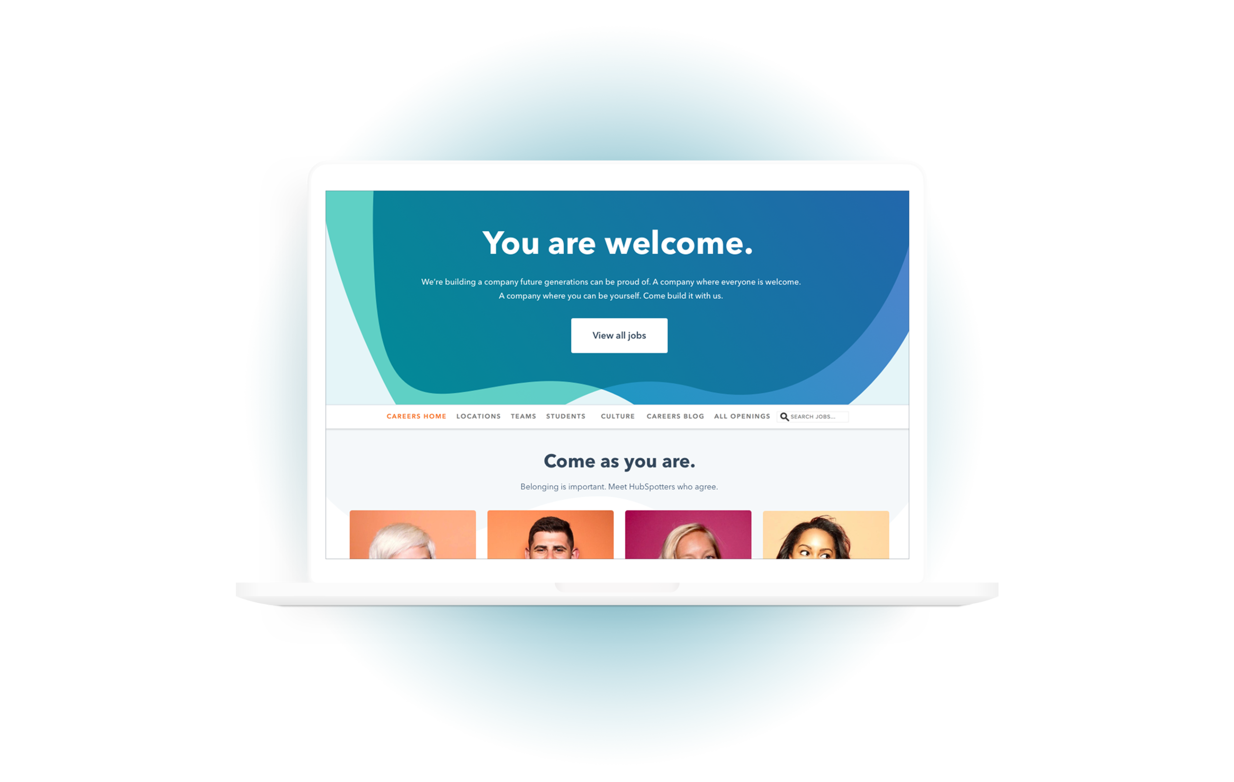
My goal was for the essential elements of the page to meet WCAG AA standards for minimum contrast with a contrast ratio of 4.5:1 (excluding large or incidental text, or logotypes). At first glance, the design of the page may appear simple; but every element was designed intentionally and with accessibility in mind. Take the hero:
The dark background ensures the knockout headline and subhead are legible.
The background shapes are gradients of blue and green, which contrasts starkly against the orange of the primary CTA. In addition, our blue-green gradient is one of the darkest in our style guide, and therefore one of the easiest to see.
In addition to meeting minimum standards for contrast, I also tested contrast for visitors with visual impairments using a Sketch plugin called Stark. Examples of Stark in action below:
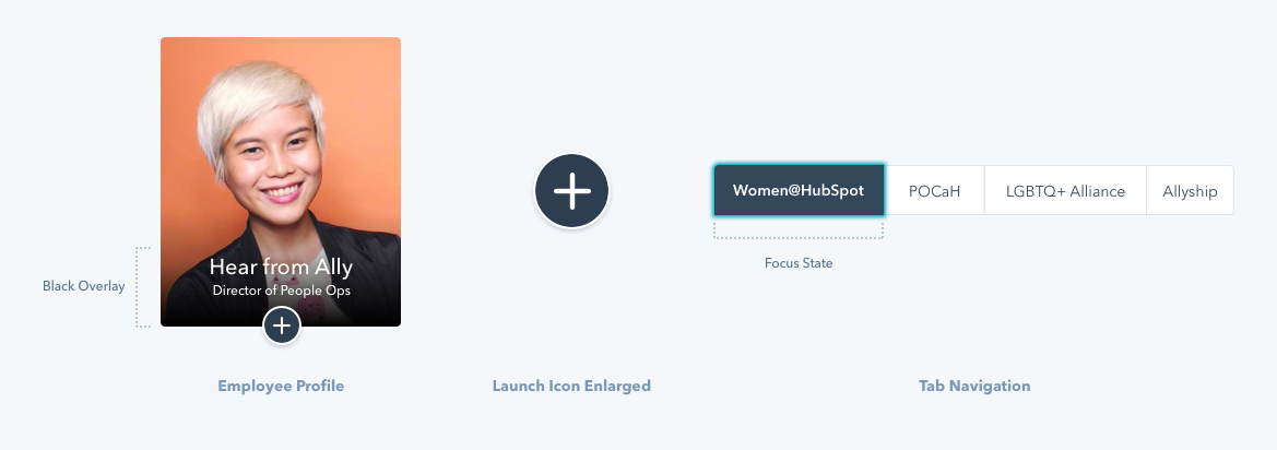
Moving down the page, the next section highlights employee profiles. For each profile, I included a transparent black overlay beneath the employee’s name and title to aid in legibility. I also included a modal launch trigger -- a circular plus icon that opens a modal with more information on that employee’s thoughts on diversity and inclusion. The launch icon is designed with a navy blue (Pantera) background and white plus sign for maximum contrast.
We took pains to ensure legibility across every element of the page. For example, we adjusted the focus state of tab navigation to utilize the same Pantera background and white text, as opposed to our typical teal Calypso. Similarly, we adjusted the gradient background of the pre-footer CTA to better support white text. And wherever possible, we ensured large bodies of text were supported by simple white backgrounds.
In addition to designing for Level AA contrast and legibility, we also aimed to ensure every action a user could take on the page was clearly and simply explained. For the employee profiles, this meant including the launch icon rather than hope users hovered over the images and realized they were clickable. As the layout began taking shape, we made sure to include icons to represent distinct actions a user could take, like clicking a link that opens in a new window or clicking a video play thumbnail.
For the employee programs module, we included explicit, clear language for links like “Learn more about this recognition.” While the pie charts within the industry data section provide engaging splashes of color, we also included all the data that informed the charts within on-page tables. Committing to this level of transparency meant that users didn’t have to go digging for the information themselves and ensured users with color-blindness could also easily access the most important data.
Development
Kara from the Web Team was the lead developer on this project. In order to build a fully accessible page, there were numerous factors she considered. She used a browser extension called the Web Accessibility Evaluation Tool (WAVE) to test the overall page hierarchy, including heading tags. She used an additional extension called Color Contrast Analyzer to double-check the contrast in order to comply with WCAG AA standards. She added a “skip to main content link,” which enables users with screen readers to skip the main navigation (if they so choose) and get right down to the good stuff.
Next, she evaluated keyboard functionality for improved accessibility. The Nielsen Norman Group advises—for users who can’t use a mouse—to make interactive and navigation elements easily accessible by tabbing, and to display a keyboard-focus indicator. Kara referenced ARIA docs for best practices on carousel and tabs and used ARIA inputs to hide elements off-screen, instead of relying on “display: none” (which eliminates content from actually being read by a screen reader). She also instituted focus outlines on tabs and the photo grid, and added small icons on the photo grid to indicate to users “heads up: clicking this card will send you to a new page.”
Finally, with the page built, she underwent extensive browser and device testing. She used actual devices for testing (computer, tablet, phone), in conjunction with BrowserStack, a tool that provides access to 2,000+ browsers and devices. She used a Chrome tool called Lighthouse to conduct an audit on page load timing. As we all know, page load time is key: for SEO and for general UX. Users expect pages to load in two seconds, and after three seconds, up to 40% of users will abandon your site.
The result, we hope, is a beautiful page that is speedy and informative for all users—no matter their browser, device, dial-up speed, or method of consuming online content.
Final Audit
So we’re approaching our final QA, feeling great about the design of the page, and we decide to conduct a final accessibility audit. We expect to pass with flying colors, but lo and behold, we encountered some concerns.
As it turns out, the audit actually surfaced contrast concerns with a few of our style guide components. Thanks to the audit, we were able to address these concerns and kick-off a project to update the universal style guide, used by both the Product and Marketing teams. In total, designing with accessibility front of mind not only improved the usability of the Diversity & Inclusion page -- it also strengthened our core brand elements and sparked a larger conversation on how we can better integrate accessibility best practices in the future.
Special thanks to Corey and Kara for being incredible creative partners and contributing to the copy and development portions of this post.


